
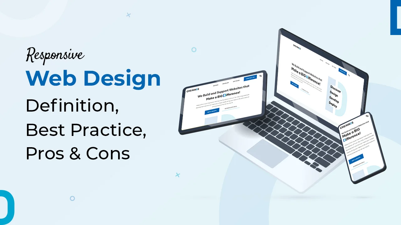
Have You Shrunk Your Website Yet?
Demystifying Responsive Web Design in a World of Shifting Screens
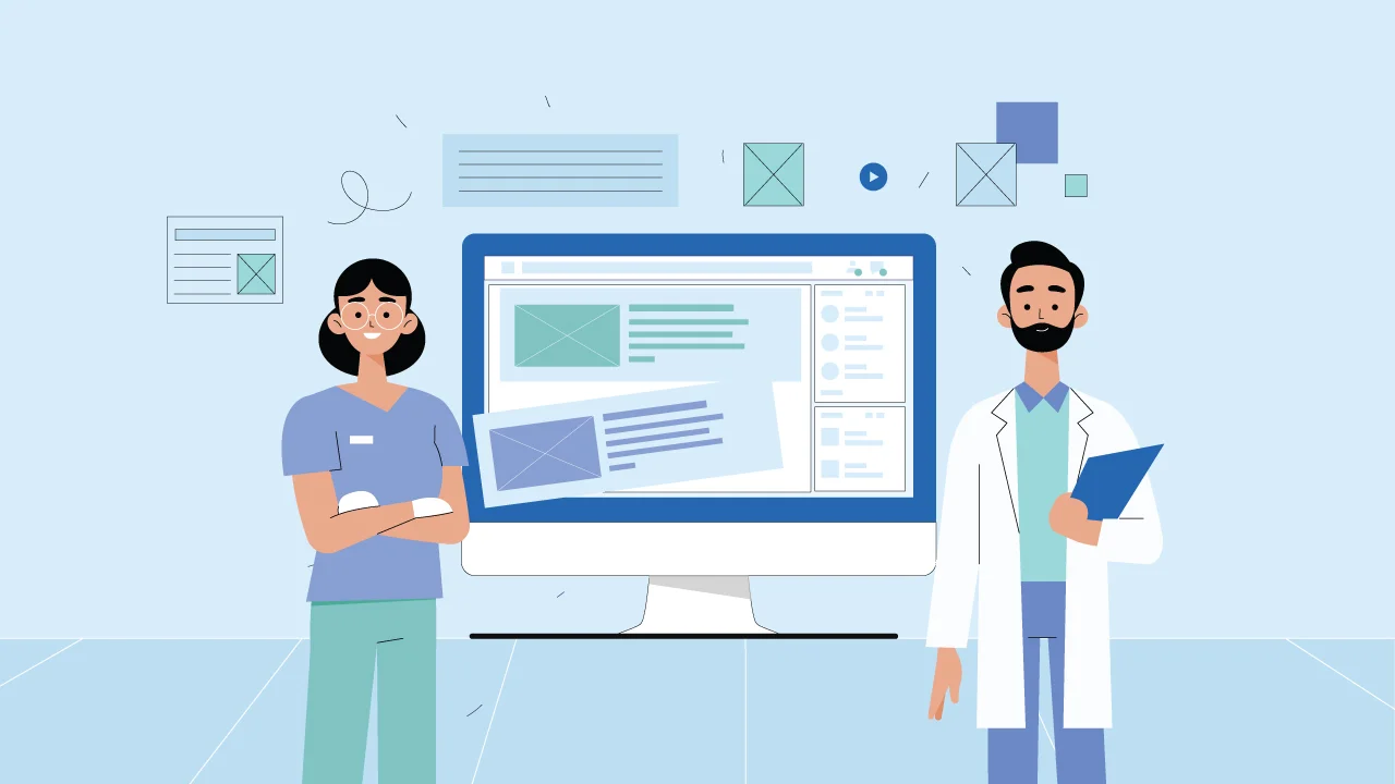
Imagine blindly navigating through a maze…
Every turn is just a guess, and every step taken in the dark. This is how users feel while browsing through a website that hasn’t yet embraced responsive web design – an RWD “chameleon”.
In today’s era where screens contract and expand like a musician playing accordion, the one-size-fits-all approach is as archaic as an analogue phone.
RWD, is not just another jargon; it’s actually a worldview. It means creating websites that are able to cross different devices ranging from large screens in our offices to small ones in our pockets.
Envision your content as if it were an origami work with fluidities such that it keeps folding into various forms that suit each platform accordingly.
No more squinting at microscopic text or fighting with menus that belong in a Lilliputian circus.
RWD is about making your website feel like a warm hug, regardless of the device it’s embraced on.
The Perks of Playing Nice with Pixels
SEO: The Virtuoso of Responsive Web Design (RWD)
Responsive Web Design (RWD) isn’t merely a design strategy; it’s a virtuoso performance in the grand errand of Search Engine Optimization (SEO). The tangled dance between RWD and search engines, with Google taking center stage, creates a harmonious experience that resonates with the algorithms governing online visibility.
In the world of SEO, consistency is the golden note. RWD emerges as the virtuoso, playing this note flawlessly.
A website that seamlessly adapts to every screen size becomes a beacon of reliability in the eyes of search engines. It’s not just about aesthetics; it’s about delivering a consistent and user-friendly experience across a diverse array of devices.
The reward for this symphony of consistency is akin to a virtual celebration. Google, the maestro of search engines, responds with enthusiasm.
As your website embraces the principles of RWD, Google metaphorically showers confetti in your virtual direction. This celebration comes in the form of higher rankings on search engine results pages (SERPs) and the revealing of friendlier algorithms.
The essence of this digital win-win scenario lies in the fact that users searching for information or services on various devices are more likely to encounter a website that adapts to their screen seamlessly. This, in turn, enhances the overall user experience and satisfaction, a key metric that search engines like Google and Bing prioritize.
The harmony of RWD in the SEO extends beyond a mere aesthetic appeal. It aligns with the core principles that search engines value – providing users with relevant, accessible, and consistent content. Between RWD and SEO, your website becomes not just a performer but a standout virtuoso, ensuring that the search engine serenade resonates positively with both algorithms and users alike.
The marriage of form and function in RWD transforms your website into a beacon that not only attracts search engines but captivates and retains an audience in the ever-evolving digital landscape.
Content: The Magic of Responsive Web Design (RWD)
Responsive Web Design (RWD) isn’t just a design philosophy; it’s a transformative process that turns your website into multiple content dimensions, revolutionizing the way you manage and present information. Gone are the days of juggling separate versions for desktops and mobiles – RWD introduces a seamless and efficient solution.
Imagine your website as a content counter, adapting effortlessly to the varied screens it encounters. RWD allows you to update your content once, triggering a magical transformation akin to a superhero fixing a wardrobe malfunction.
Whether viewed on a desktop, tablet, or smartphone, your content morphs to fit each screen perfectly. This not only saves invaluable time and money but, perhaps more importantly, preserves sanity of the web.
RWD acts as the tailor, ensuring your content suits every screen it encounters, providing a consistent and visually appealing experience to users across diverse devices.
User Experience: Crafting Digital Bespoke Suits with RWD
Think of your website as a bespoke suit, tailored with precision to fit the unique dimensions of each user’s device. RWD transcends mere aesthetics; it’s a curator of an immersive user experience, leaving users in a state of euphoria.
In this digital tailoring process, text becomes legible, buttons respond seamlessly to touch, and layouts guide navigation like a gentle sherpa, making sure a user-friendly journey through the digital landscape.
RWD transforms your website into functional art – an exquisite blend of form and function. It’s not just about flashy design; it’s about creating an online environment where users feel at ease, finding what they need effortlessly.
The result?
Users don’t just browse; they become patrons of an exceptional digital experience. The euphoria of a well-tailored website extends beyond mere satisfaction; it cultivates loyalty.
Users, now transformed into happy patrons, become enthusiastic fans who sing your praises across social media feeds and metaphorical rooftops. Word-of-mouth endorsements in the digital age are priceless, and RWD ensures that users not only visit but revisit, forming a lasting and positive connection with your brand.
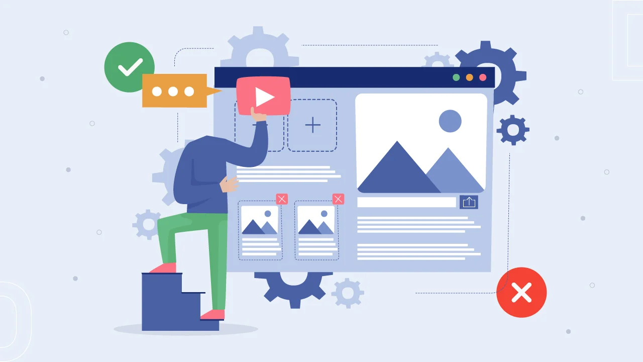
Of Course, Every Rose Has Its Thorns (But They’re Tiny)
1. Complexity Cauldron
Building a responsive website requires a touch of finesse beyond its static counterpart. It’s akin to a delicate act – juggling flaming chainsaws while riding a unicycle. Not everyone possesses the coding skills or the fortitude for such a task.
Fortunately, Responsive Web Design Services in Raleigh step in as virtuoso craftsmen, ready to weave their magic and turn your website into a pixel-perfect masterpiece. The complexity becomes an opportunity for professionals to showcase their expertise.
2. Testing Tango
Testing a responsive website may feel like chasing butterflies in a hurricane due to the plethora of screen sizes and resolutions.
Yet, fear not!
Thorough testing becomes the key, and expert RWD developers wield the tools and know-how to ensure your website executes a flawless dance across every platform.
It’s a meticulous tango where each step is scrutinized, certifying your digital creation maintains its grace in the diverse world of devices.
Ready to ditch the blinders and join the RWD revolution?
Reach out to your friendly neighborhood Web Development experts in Raleigh. They’ll help you craft a website that’s as flexible as a gymnast and as stunning as a sunset, ready to captivate audiences on every screen imaginable.
Don’t wait, the future of web design is now, and it’s delightfully responsive.